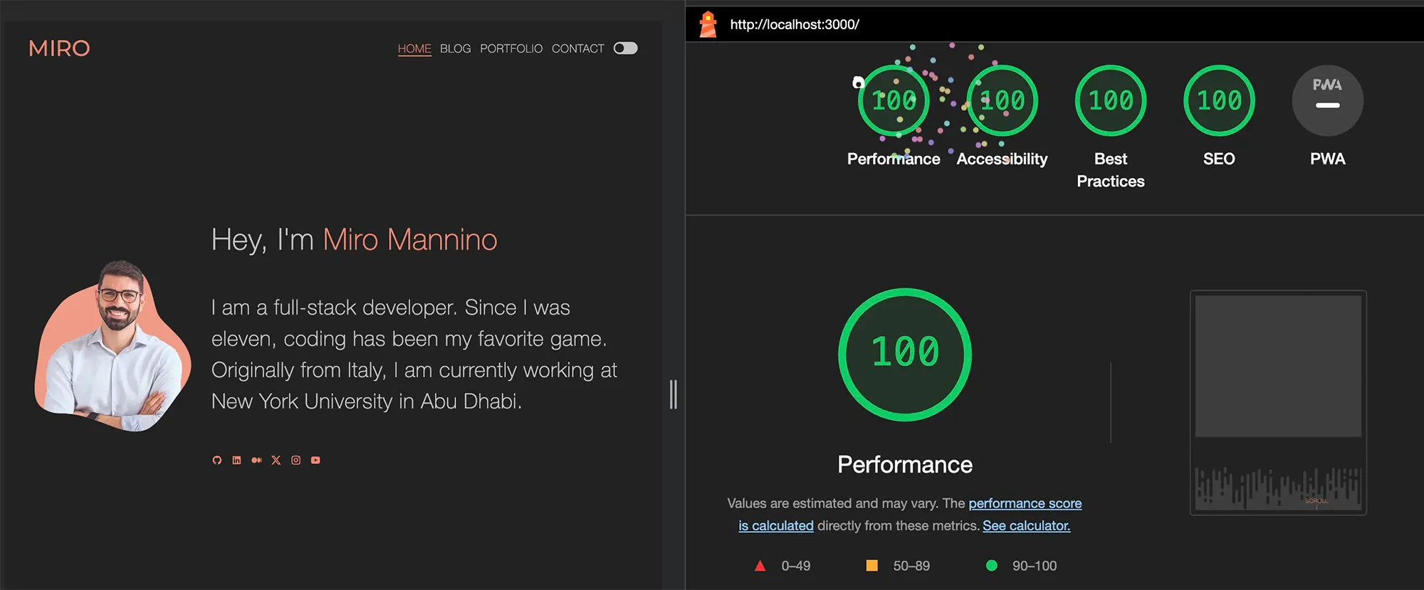
I tried to build a minimalistic look for this website, highlighting coding as an art form. Animations try to enhance the interface without compromising usability. The website keeps a conventional layout while still using generative art as design elements.
High performance using a Multi-Page App (MPA)
In this website I tried to solve the "Portfolio Paradox": wanting heavy animations without destroying the performance and SEO of my content (the blog). The home and portfolio pages are designed with smooth scrolling and transitions in mind, while the blog pages have zero-JS for a more discoverable and accessible experience. This is why a Multi-Page Application (MPA), built with Astro, was the right tool for the job.
MPA technology also allows different technologies to be used on different pages, ensuring backward compatibility with my older projects.
Server rendering at compile time
The blog is intentionally designed to be server-rendered, bypassing the need for client-side rehydration. This way pages load faster and are more easily crawlable by search engines, making the blog also more accessible and discoverable.
Performance results
With all of these optimizations I was able to obtain great results with Lighthouse.

Dividers
The following section divider is drawn on an canvas, and it is a dynamic and random system where each bar moves independently, rising and falling in a carefully orchestrated movement. These bars also interact with the mouse!
For the curves section divider, I created a series of animated waves on an SVG. Each wave is defined by a series of random points using a Catmull-Rom spline algorithm. Curves are created to be progressively bigger and less opaque, layering in this way. At random intervals the animation introduces movement by altering the horizontal translation of each wave; the user's scroll accelerates it.
The section dividers are drawn on a canvas as a series of random points connected by a smooth curve: a polyline interpolated with a spline algorithm. As you scroll, the points gradually shift to a new random configuration, making the divider slowly morph and flow between shapes. To show these separators, here are two of them configured to move without need to scroll:
Random code header
I wanted something that recalled the idea of "coding", resembling the Matrix movie effect. The idea is to have part of the website code minified and printed randomly, faded in and out randomly.
Using SCSS for complex animations
The decision to utilize SCSS was to have complete control in styling, allowing me to create complex animations. I used it with CSS modules, allowing styles to be isolated from other components and pages, ensuring a clean codebase. Additionally, CSS modules result in significant space savings of up to 70% when these are minified for production.
SCSS Animations Examples
Buttons have an interesting animation on mouse hover only using CSS transitions using both before and after pseudo-elements for the double layering effect.
The menu contains an animation at mouse hover
Page change transition
This website has a curtain-style animation for page transitions with a curtain descending upon page unload and ascending upon page load. This animation was still possible even though this website is an MPA, meaning that going from one page to another it actually means loading a new web page. To implement this animation, I needed to delay hyperlinks, allowing the exit animation to conclude before the page changes. It was difficult and unconventional, but possible.
For the blog section I wanted to have a minimal amount of JavaScript running, for easy SEO performance. In this case View Transition API was used for the animation.
For the theme toggle, I implemented a similar animation. Similar to the page change animation I needed to delay the CSS variable changes to switch the theme when the curtain is fully covering the page, without refreshing the page.
Featured Blog posts animation on scroll
This animation is a custom one that makes sure that all the blog posts are going to be visible at some point independently of the browser size.
Page 404 animation
For the page 404 I thought it would be fun to have a sort of a poem warning people, with an interesting animation. I did that simply with some React and a minimal amount of JavaScript.