When working with code in web applications is sometimes needed to have a
responsive and easy-to-use interface for displaying and editing code. I had
experience in the past creating a custom component for React but it was the
first time trying it out with shadcn/ui and there wasn’t anything either
online about it.
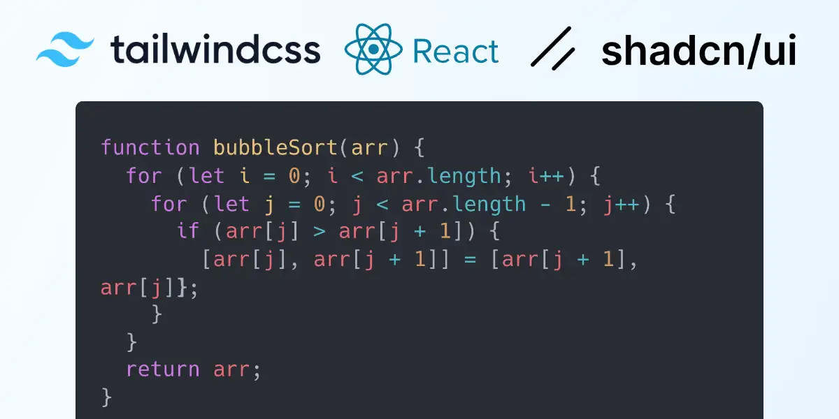
So in this post I will introduce a new component CodeBlock which will work
with Tailwind CSS, React and shadcn/ui together.
Key Features
- Language Support: The component can be configured to highlight syntax for different programming languages.
- Dark and Light Mode: It supports both dark and light themes.
- Customizable Styles: The component is wrapped in a
divthat can be styled using Tailwind CSS classes. - Accessibility and Ref Forwarding: By using
React.forwardRef, the component can accept a ref that can be used for more direct manipulation or integration with other components that utilize refs.
Implementation
Here is the implementation of this components which you can add directly in the
src/components/ folder.
import React, { useRef } from "react";
import { cn } from "@/lib/utils";
import CodeEditor from "@uiw/react-textarea-code-editor";

export interface CodeBlockProps
  extends React.TextareaHTMLAttributes<HTMLTextAreaElement> {
  language?: string;
  darkMode?: boolean;
}
const CodeBlock = React.forwardRef<HTMLTextAreaElement, CodeBlockProps>(
  ({ className, ...props }, ref) => {
    return (
      <div
        className={cn(`relative flex min-h-[80px] w-full
                       rounded border-input px-3 py-2
                       text-sm`,
          className,
        )}
        style={{ backgroundColor:
			        props.darkMode ?
				        "#333333" :
				        "#ffffff" }}>
		<CodeEditor
          padding={0}
          data-color-mode={props.darkMode ? "dark" : "light"}
          style={{
            backgroundColor: props.darkMode ?
	            "#333333" :
	            "#ffffff",
            width: "100%",
            fontFamily: "ui-monospace,Menlo,monospace",
          }}
          ref={ref}
          {...props}
        />
      </div>
    );
  },
);

CodeBlock.displayName = "CodeBlock";

export { CodeBlock };
The CodeBlock component extends React.TextareaHTMLAttributes, allowing it to
inherit all textarea properties, which makes it more flexible. It also accept
additional props such as language and darkMode to adjust its functionality.
Using Tailwind CSS, the outer div of the component is styled to have a minimum
height and responsive width, rounded borders, and padding.
CodeEditor Integration: The heart of the component is the CodeEditor from
@uiw/react-textarea-code-editor, which is styled to fill the width of its
container and match the outer div’s background color based on the selected
theme.
Example Usage
Here’s a simple example of how to use the CodeBlock component in a React
application:
import { useState } from "react";
import { CodeBlock } from "./components/codeblock";
import { Card } from "@/components/ui/card";

function App() {
  const [code, setCode] = useState(`// Your code here`);

  return (
    <div className="m-4">
      <h1 className="m-2 mb-4 text-2xl">Code Block Example</h1>
      <CodeBlock
        value={code}
        onChange={(e) => setCode(e.target.value)}
        language="js"
      />
    </div>
  );
}

export default App;
An example project I did quickly using Vite can be found here: codeblock-component-with-shadcn-ui-react-tailwind.zip
A Gist with only the component code can instead be found here